Monday 12 March 2012

What have you learnt from audiences feedback?

We asked for feedback using several social sites and using Youtube. We were given positive feedback and advice of how to improve the video further which we took on board when going back over the video

Our first round of feedback in class helped us to get another point of view of what they like an dislike about the video as our target audience is on our age range so knowing what they didn’t like about the video really helped us to change the video in order to keep the target audience. They liked the fast editing and wanted to see more of it in the video and the “Mise-en-scene” too.

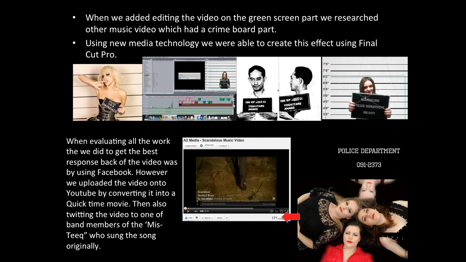
How did you use new media technology in the construction, research and planning and evaluation stages?


When researching and planning I used Blogger to document all the research I found

and made posts of any planning for the video we did. I used several extra programs such as power points and Prezi to making my blog more interesting and appealing to views to look at. You Tube has been a key part to our research and to find examples of how we would like our video to be styled like or use certain effects from a music video have been screen shot and put on my blog for example.


When we added editing the video on the green screen part we researched other music video which had a crime board part.
Using new media technology we were able to create this effect using Final Cut Pro.


When evaluating all the work the we did to get the best response back of the video was by using Facebook. However we uploaded the video onto Youtube by converting it into a Quick time movie. Then also twitting the video to one of band members of the ‘Mis- Teeq” who sung the song originally.


How effective is the combination of your main product and ancillary tex


Having thought about the music video I thought the presentation of my Digipak and poster must reflect the band as a whole. I decided to use the theme colours from the video red, white and black in both products I made. The video contains hidden references to our band such as the rose at the beginning falling to the ground and having a red rose air fresheners hanging from the mirror in the car with be a perfect reference to carry on within my products. Besides the fact the roses is part of the bands name.


My Poster and Digipak are themed in the colours of red white and red like the music video. I also made the roses a main feature in both products. I kept the codes and conventions of a girl band by having them all on the front cover together on the Digipak and having different images linking them all together. I also included the record label for our product SONY BMG and the copyright part plus the logos and website addresses which are all elements needed on the Digipak to give the audience details on the band.
My Digipak is a six sided piece with the top part flipped so if it were folded it would make an actual Digipak. I made more song names that to me fitted in with the whole image and style of the band, dark and edgy but still having that sexy girl band look. I used roses as a border on three of my panels to link in with the names and kept to the theme colours we had chosen for the band. I wanted to also have a panel where each band member was in black and white with a red splatter as the background. This makes a contrast to the front cover as that is light and fresh looking with this bottom left panel is more dark and mysterious.

In the poster I thought it would be a good idea to have a picture of the album cover on the poster so audiences would establish it the same album. I also decided to have the song to our music video ‘Scandalous’ as the Albums name. Simply because it would be the products first release song off the album and to prompt audiences to buy the rest of the album.
It keeping in touch with the Digipak and poster I carried on the roses idea and having it as a main feature for my poster. I used the images I edited as well because they were black and white, again staying the theme. The date I have choosen is also valentines days so having red as a dominant colour on the poster would attract audiences in because of Valentines Day.
I also made sure the record label, stores and websites were added at the bottom as they are key element to have on a album release poster.

In what ways does your media product use, develop or challenge forms and conventions of real media products?

For our project we all researched the codes and conventions of girl bands. I researched pop/rock genre bands that used different styles of editing and shots such as split screening and establishing shots of the group. I also noticed a narrative for most videos with a relationship on visuals and the lyrics from the song.
In our music video we decided to add an intertextual reference with the Guns and Roses top. As our band was partly influenced but the edgy rock look.

I was able to create a relationship with the music and visuals by editing quick shots to match the music with the main beat in the song.

We kept the relationship of lyrics and visuals as well. For example the images to the left are screen shots of when we have a relationship between the too. The middle is when the song says “Rough neck all around” and the top and bottom are when they are singing within the narrative plot.

The split screen which I edited myself shows all four band members and are staggered to the appear of the screen on by one. In recent videos split screening has become more of a popular effect used within videos like in Lady Gaga’s music video Telephone.

I decided to link both the idea of an establishing shot of the group with split screening and have them together and repeat it on high points of the video. I thought this would be a good way to make the audience remember the band with a twist on the establishing shot making the video more interesting to watch.

The right picture is the establishing shot of the group. The photo on the left is used on a certain part of music to again keep the attention of the audience.

Here are shots we used in the video of the band together singing and a long shot of the band walking forward which is repeatedly used in the video.

Thursday 1 March 2012

Journal

From the feedback I received I have made changes to both my Digipak and poster. I got positive feedback for both my products I made. I am pleased with the results and have only a minor improvements and changes to make it better. The roses I used was the most popular feature that I used, they liked how I used that to link both my products together and in the band as well.

I have decided to only add column's onto my Digipak so that if you were to fold it, it would have the name on the sides like a real Digipak. I also changed the colour of the writing on the back to a more brighter red as I noticed on the larger screen when represented to the class it was a little dark for my liking.

Final Version of My Poster


This is my final version. I have made one change, by adding the album cover from my Digipak onto the poster. I strank my flowers and moved the band members up so I fit the album picture onto the poster. That was the only suggestion made for my poster which I decided to include as I thought it would make a good link from the Digipak album and poster.