Tuesday, 13 March 2012
Monday, 12 March 2012
What have you learnt from audiences feedback?
We asked for feedback using several social sites and using Youtube. We were given positive feedback and advice of how to improve the video further which we took on board when going back over the video
Our first round of feedback in class helped us to get another point of view of what they like an dislike about the video as our target audience is on our age range so knowing what they didn’t like about the video really helped us to change the video in order to keep the target audience. They liked the fast editing and wanted to see more of it in the video and the “Mise-en-scene” too.
How did you use new media technology in the construction, research and planning and evaluation stages?
When researching and planning I used Blogger to document all the research I found
and made posts of any planning for the video we did. I used several extra programs such as power points and Prezi to making my blog more interesting and appealing to views to look at. You Tube has been a key part to our research and to find examples of how we would like our video to be styled like or use certain effects from a music video have been screen shot and put on my blog for example.
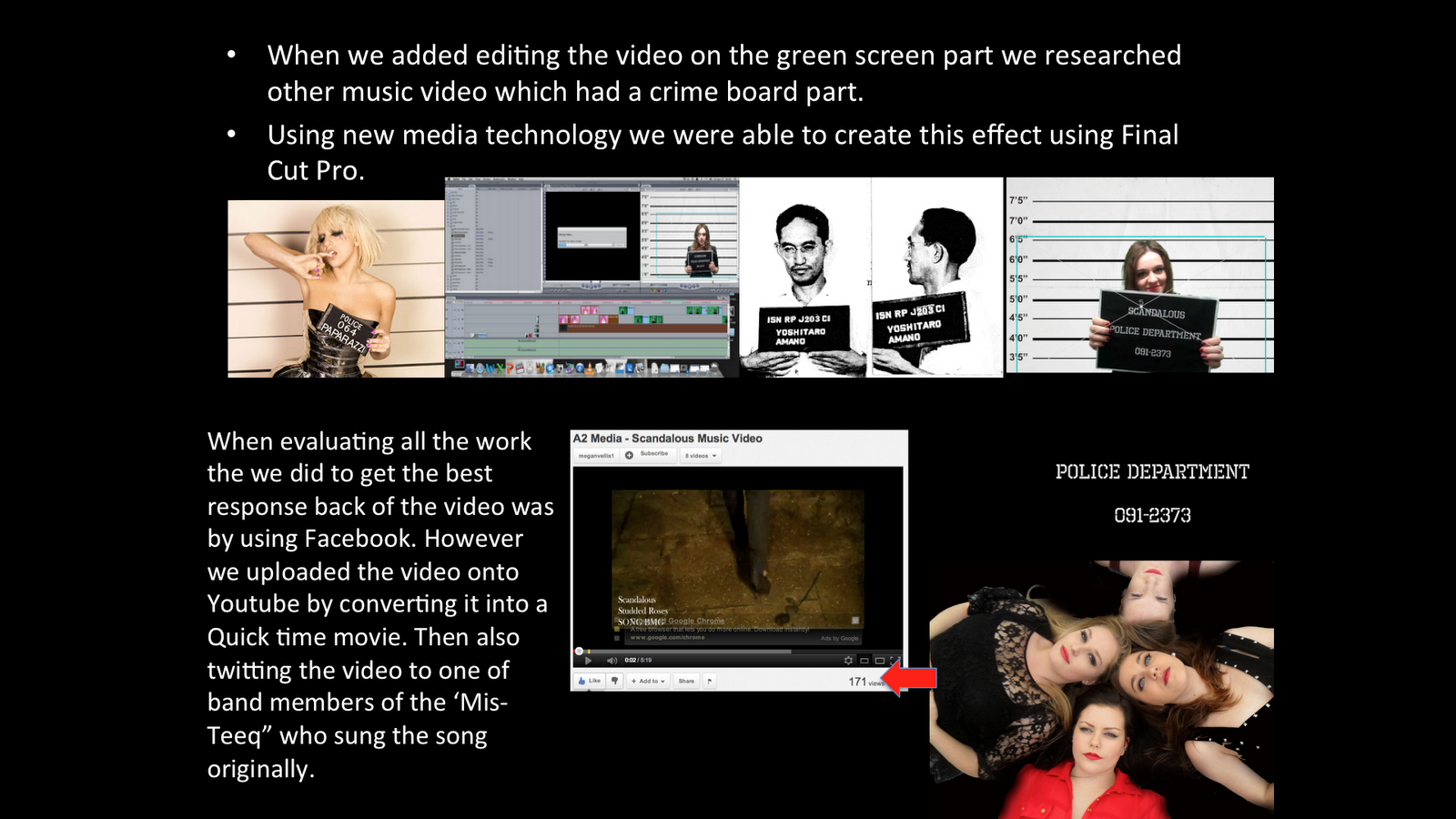
When evaluating all the work the we did to get the best response back of the video was by using Facebook. However we uploaded the video onto Youtube by converting it into a Quick time movie. Then also twitting the video to one of band members of the ‘Mis- Teeq” who sung the song originally.
How effective is the combination of your main product and ancillary tex
Having thought about the music video I thought the presentation of my Digipak and poster must reflect the band as a whole. I decided to use the theme colours from the video red, white and black in both products I made. The video contains hidden references to our band such as the rose at the beginning falling to the ground and having a red rose air fresheners hanging from the mirror in the car with be a perfect reference to carry on within my products. Besides the fact the roses is part of the bands name.
I was able to create a relationship with the music and visuals by editing quick shots to match the music with the main beat in the song.
We kept the relationship of lyrics and visuals as well. For example the images to the left are screen shots of when we have a relationship between the too. The middle is when the song says “Rough neck all around” and the top and bottom are when they are singing within the narrative plot.
The split screen which I edited myself shows all four band members and are staggered to the appear of the screen on by one. In recent videos split screening has become more of a popular effect used within videos like in Lady Gaga’s music video Telephone.
I decided to link both the idea of an establishing shot of the group with split screening and have them together and repeat it on high points of the video. I thought this would be a good way to make the audience remember the band with a twist on the establishing shot making the video more interesting to watch.
Here are shots we used in the video of the band together singing and a long shot of the band walking forward which is repeatedly used in the video.
Sunday, 11 March 2012
Saturday, 10 March 2012


Thursday, 1 March 2012
Journal

Final Version of My Poster

Tuesday, 28 February 2012
Feedback
 Amy tweeted one of the original band members of the song. And she retweeted our work to her fans in hopes of getting some more feedback on our work.
 I posted our video on Facebook to try get more feedback from some of our friends. We got positive feedback and some advice on how to improve our video from an ex student from Welling, which was helpful to improve the video.


Monday, 20 February 2012
Research in Album Poster
 I choose these poster to post on my blog because each poster has a different style. Katy Perry's poster is of her first album and having her on the cover really establishes who the artist is. I also like the fact that it has the CD cover on here too so the audience will know which album is hers.
 The poster is very bold and clear. I like this because of the colours and keeeping it simple but it works in making a statement and standing out from the rest of the posters. Having Lady Gaga on front would attract all her fans straight away. Having the small amount of colour however makes the poster more appealing and eye catching to the audience.
 This poster is very well themed linking her CD cover with the poster. As Britney Spears is such a famous star already adding her face isn't necessary but having her name in bold letters grabs the audiences attention. Using Red on almost white background also makes the poster more bright and snappy. This also including her number one hit on here to advertise how popular the album is already and to make the audience want to buy the album and listen to more of her songs.


Typography used at the beginning of music videos
 In this video is very Beetle Juice style, having colour writing in a sort of comic book style keeps in theme with the music video however the writing stands out and the positioning makes the audience read it to know who it is.
 I have been looking at different typography's used on video at the beginning to help make a decision whether to add a style at the beginning of ours or keep it simple. Both ways are effective but however with this being the first song released with the 'Studded Roses' It would be best to keep it simple.
 If the group were to become more successful we would consider using the logo of the band at the beginning of the video as it would make the audience instantly know who they are by a quick glimpse at the screen. Like in this image below Pussycat Dolls use this logo in a lot of their videos.
Feedback

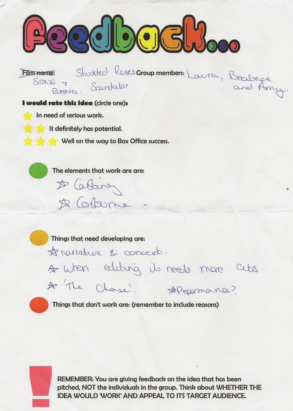
 When we presented our video to the class we were given feedback on how to improve our video. We were asked questions about what happened to the boy in the video and to break up the last section of the video. Taking on board their feedback we have decided to change it adding a few more clips with the boy at the end to make the story clearer as to what happened to him. We added the clips with the boy at the end as well to break up the crime board section like suggested.
Friday, 10 February 2012


Wednesday, 8 February 2012
Journal
Some of Typography
 This is an example of the typography we would like to use in our music video. We want the words to over lap on the chorus and certain phrases.
Tuesday, 7 February 2012
Development of Video


 We decided to develop our music video further by adding words. We thought of using different typography and having them over lap each other would make the video more advanced looking. Using Rihanna's Ya Do One video we were able to get ideas of how we would want ours to come out in the video.
Tuesday, 31 January 2012
Split Screen
 To make this split screen I dragged each video on top of one another then staggered them so they came of one by one. I also have to resize the videos to make all four band members fit on the screen. I want this effect to be repeated in the video as a high point.
Monday, 30 January 2012
Journal

Green Screen Shots


